05
Corporate Logo - LPs, Investors, & Fundraising

The Corporate Logo reflects Draper’s legacy. trusted by investors, LPs, and partners for over 40 years. Carefully refined from its original form, this mark preserves the integrity of Draper’s heritage while aligning with today’s standards of clarity and professionalism. It’s designed for formal use across investor communications, official documents, Legal Documents, and long-term partnerships.
04.1
Lookup
The Draper logo encapsulates our brand essence, acting as a succinct and memorable symbol that resonates across diverse scales and mediums.
BRANDMARK
Wordmark
The safe zone for the logo equals the width of the small circle within the logo.
04.2
LOGO
The Draper logo is designed with flexibility in mind and can be used in either a horizontal or stacked format depending on the context. This adaptability ensures the brand maintains clarity, presence, and balance across a wide range of applications.
BRANDMARK
Wordmark
The safe zone for the logo equals the width of the small circle within the logo.
03.2
SAFE ZONES
The exclusion zone safeguards the legibility and impact of the logo by isolating it from other visual elements like text, graphics, and imagery.
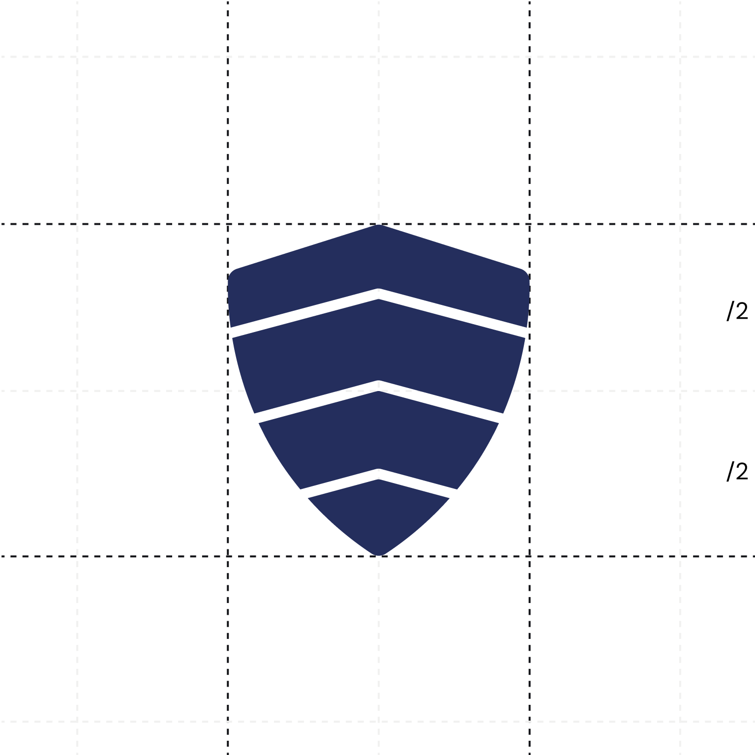
The safe zone for the logo equals the width of the small circle within the logo.
The safe zone for the logo equals the width of the small circle within the logo.
03.3
COLOR COMBINATION
Understanding these color choices empowers you to effectively represent Draper across various mediums while staying true to our brand's identity.
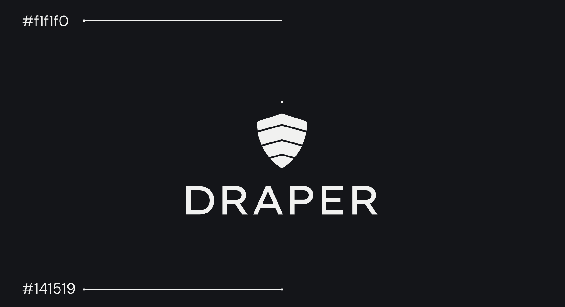
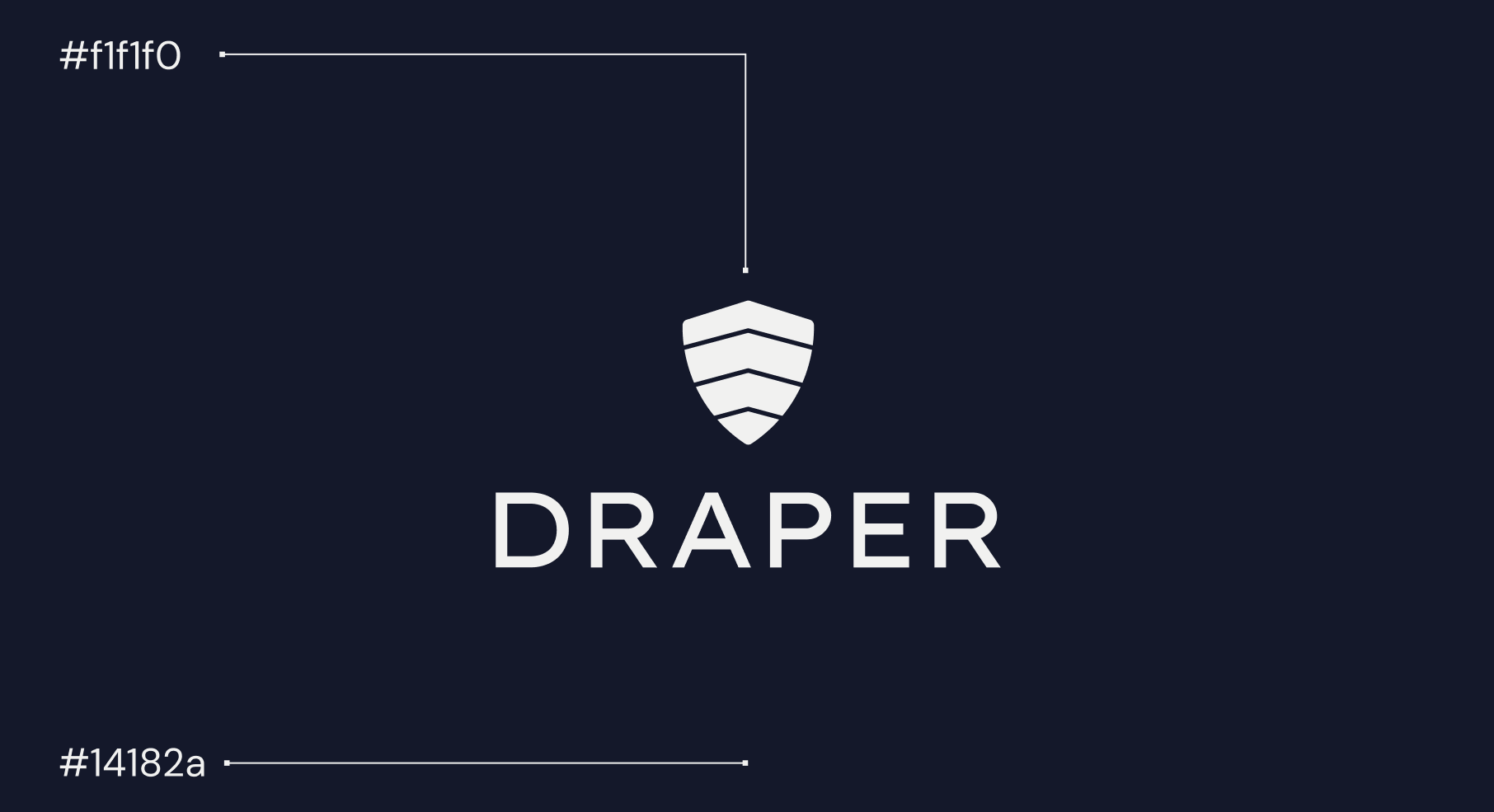
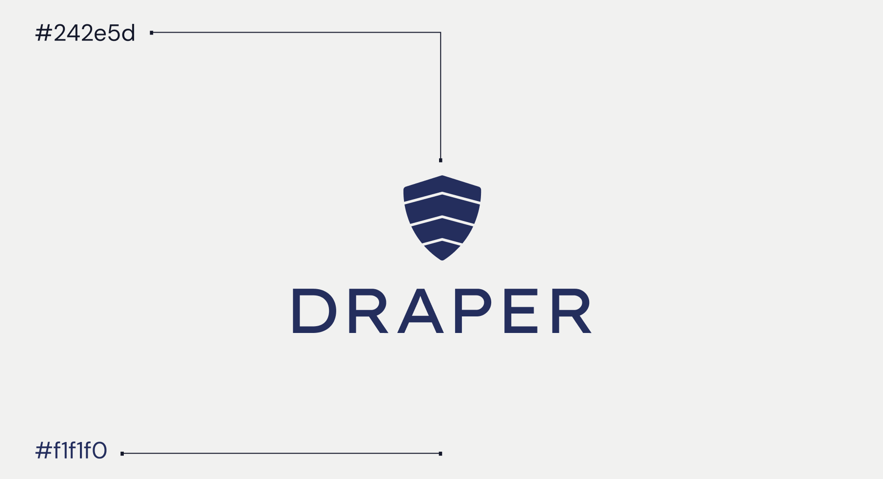
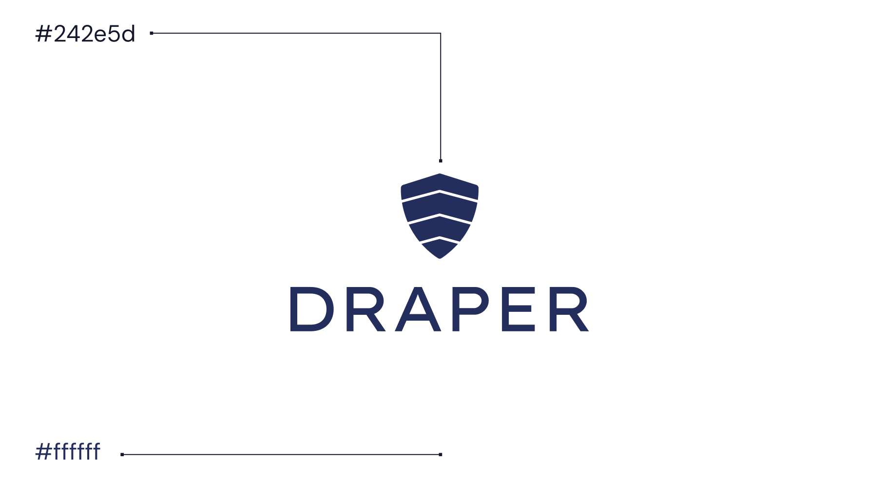
03.3
COLOR COMBINATION
Understanding these color choices empowers you to effectively represent Draper across various mediums while staying true to our brand's identity.


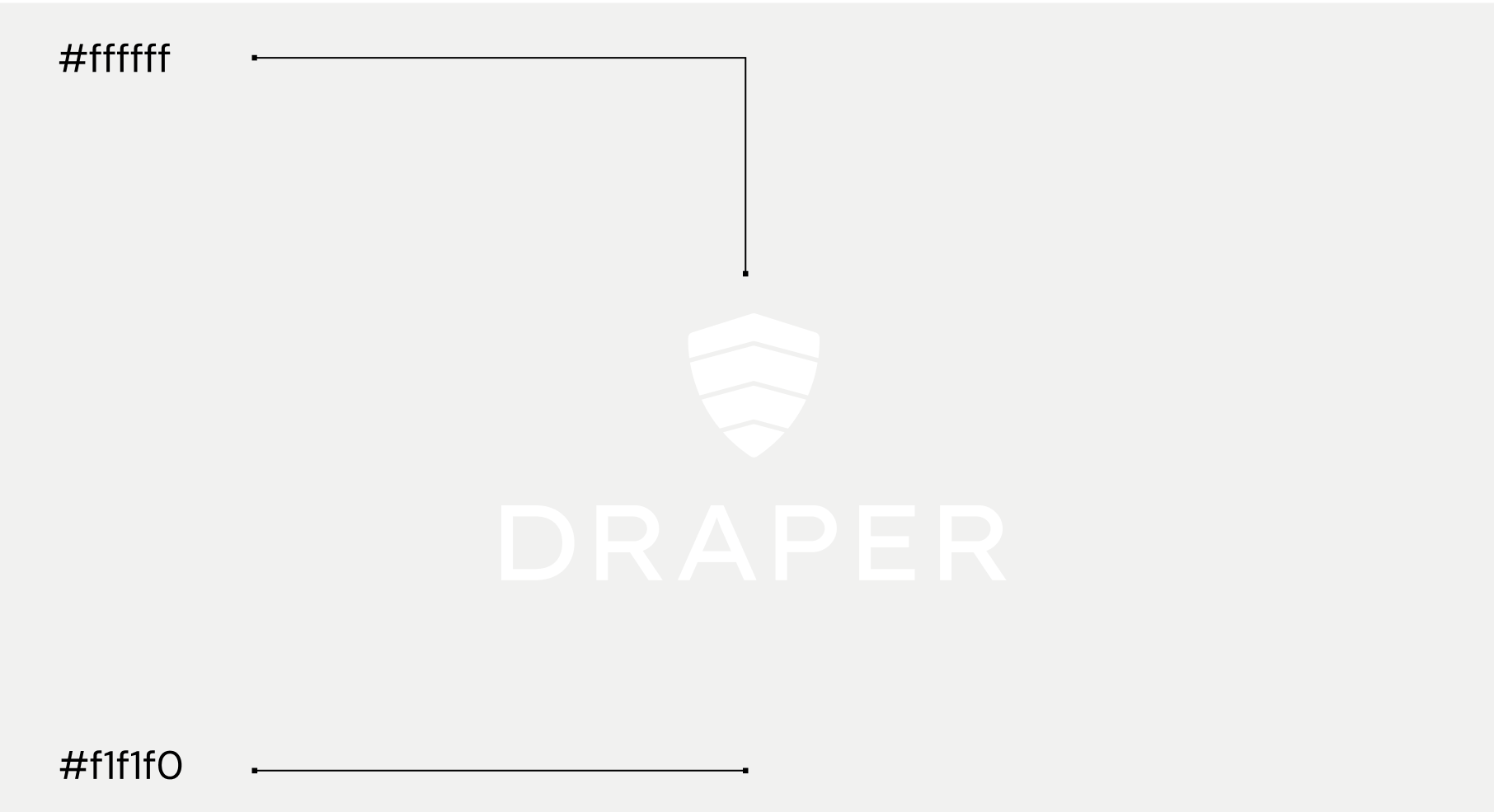
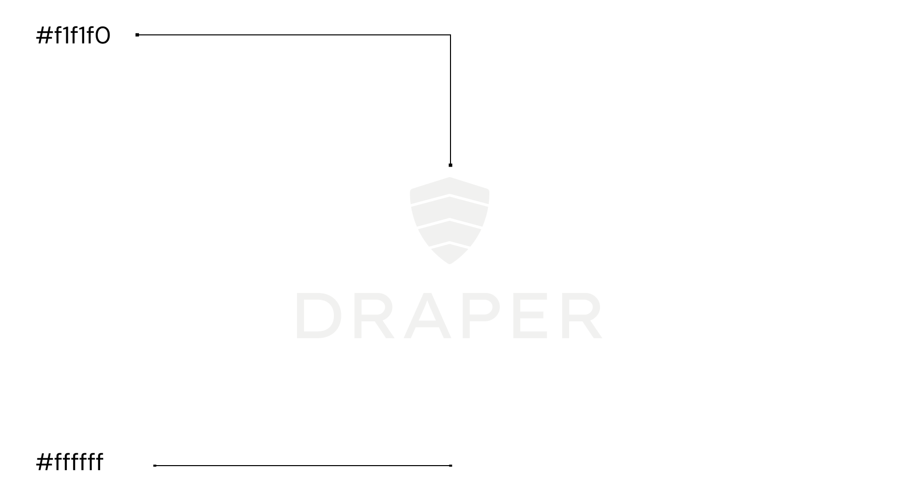
03.3
INCORRECT COLOR COMBINATION
Understanding these color choices empowers you to effectively represent Draper across various mediums while staying true to our brand's identity.
.png)
.png)
.png)
.png)
03.3
INCORRECT LOGO USAGE
To maintain the brand consistent across all mediums and platforms, it's crucial to make sure the logo is not altered from it's original state or color combinations.